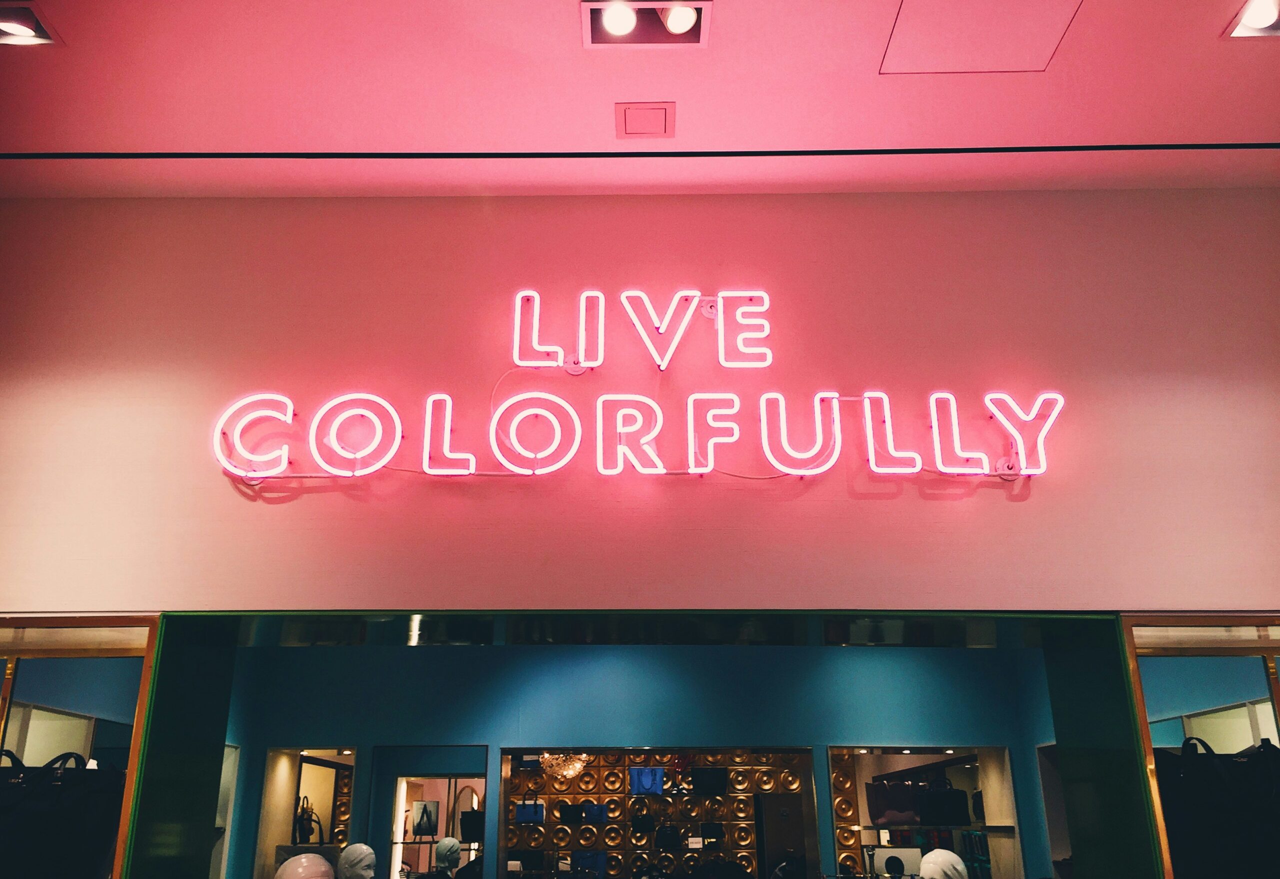
Color quietly plays a major role in how we experience the world. It influences our emotions, behaviors, and even physical reactions, often without us realizing it.
In commercial spaces ranging from offices and healthcare facilities to retail stores and restaurants, strategic use of color can shape customer experiences. It can also influence decision-making and enhance brand identity.
This is where the study of color psychology becomes important.
What is the Science Behind Color Psychology?
Color psychology investigates how various colors impact emotions, actions, and mental health. Research shows that different hues can trigger chemical reactions in the brain, leading to specific emotional outcomes.
For example, the color red increases heart rate, evoking feelings of excitement, passion, or even danger. Conversely, blue has a calming effect, slowing down the heart and breathing rates and promoting tranquility and stability.
Businesses have long harnessed these subconscious influences in branding and marketing, using color to shape consumer perceptions and drive behavior. Yet, the application of color psychology extends beyond marketing.
Why Color Matters in Commercial Spaces
In commercial spaces, color does more than enhance aesthetics. It affects how people feel, how they navigate spaces, and even how productive they are. Here’s how strategic color choices can impact different types of commercial environments:
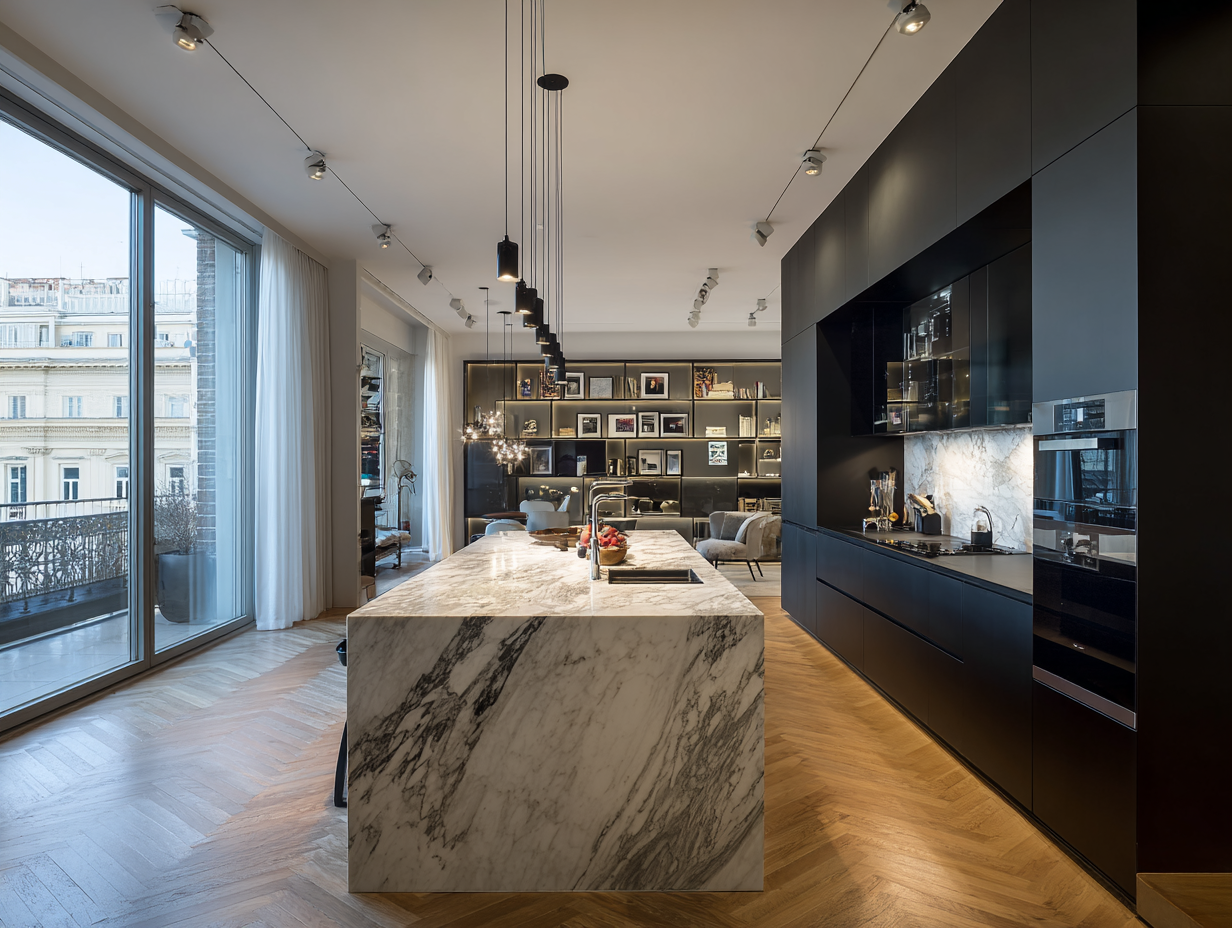
1. Offices
In office settings, color can significantly influence productivity, creativity, and employee well-being. Blue is a popular choice for workplaces because of its calming and stabilizing effects.
According to Color Psychology, different shades of blue enhance concentration, stimulate thinking, and provide mental clarity. These qualities contribute to improved productivity, making blue an ideal color for work and study environments. It’s no wonder that many tech companies and corporate offices incorporate blue-themed designs to create a focused and efficient atmosphere.
On the other hand, yellow stimulates creativity and optimism, making it an excellent choice for collaborative spaces like meeting rooms.
2. Healthcare Facilities
Color psychology plays a vital role in healthcare environments, impacting patient experiences and outcomes. For example, soft greens and blues are often used in hospitals and clinics because they evoke calmness, reduce anxiety, and promote healing.
A study published in the Health Environments Research and Design Journal (HERD) examined strategic color changes in an emergency department redesign in Sweden. The findings showed that these changes improved wayfinding.
In this study, patient areas were painted in neutral tones like gray and beige. On the other hand, restricted areas were marked with contrasting colors like red. This design enhanced patient orientation, awareness, and perceived safety.
To effectively implement such strategic color schemes, healthcare facilities often rely on the expertise of commercial painters.
According to EA Pro Painters, these professionals are skilled at selecting and applying paints that meet hygiene standards and durability requirements. They also ensure that the colors used promote a calming, healing environment while maintaining the aesthetic integrity of the space.
3. Retail Stores
In retail environments, color plays a crucial role in shaping customer behavior and influencing purchasing decisions. For example, red is known to create a sense of urgency and excitement. This is why it is commonly used in clearance sales, discounts, and call-to-action signs to encourage quick purchases.
On the other hand, luxury brands strategically use black and gold to evoke feelings of sophistication, exclusivity, and premium quality. Meanwhile, white is often chosen for its association with cleanliness, simplicity, and modernity.
This is particularly evident in tech stores like Apple, where predominantly white interiors create an open, minimalist atmosphere. The design highlights the sleekness of the products and enhances the overall shopping experience.
4. Restaurants and Cafés
Colors can even influence appetite and taste perception in dining spaces. Red and yellow are popular choices in fast-food restaurants because they stimulate hunger and quicken eating speed. In contrast, blue is one of the least appetizing colors, as it rarely occurs naturally in food. Some weight loss plans even suggest eating off blue plates to curb appetite.
For fine dining establishments, earthy tones like deep browns and greens create a cozy, sophisticated atmosphere. These colors encourage patrons to relax and savor their meals.
FAQs
How can a business ensure that color schemes align with its brand identity?
To align color schemes with brand identity, businesses should first define their core values and the message they want to convey. Colors should reflect the business’s personality- calm, professional, energetic, or friendly. Working with design professionals, businesses can choose shades and finishes that effectively convey their message and influence customer perception.
What role does lighting play in the effectiveness of color in commercial spaces?
Lighting greatly affects the way colors are perceived. Natural light can make colors appear more vibrant, while artificial lighting, especially fluorescent, may alter the way colors look. Choosing the right paint finish (e.g., matte, glossy, satin) is essential for the space. It ensures that colors reflect light effectively, enhancing the overall atmosphere.
How can businesses create eco-friendly spaces using color?
Sustainable spaces can be achieved by choosing low-VOC or zero-VOC paints, which help minimize harmful emissions and enhance indoor air quality. Available in various colors and finishes, these paints allow businesses to balance visual appeal with eco-consciousness. Additionally, selecting natural, earthy tones can enhance the connection to nature, supporting the overall eco-friendly concept of the space.
Overall, color is far more than a decorative element; it’s a strategic tool that influences emotions, behavior, and decision-making in commercial spaces. By understanding color psychology and partnering with experienced commercial painters, businesses can create environments that resonate with customers. This approach enhances brand identity and helps achieve desired outcomes.
The right colors make all the difference in offices, healthcare facilities, retail stores, and restaurants. Skilled painters are key to bringing these color schemes to life.